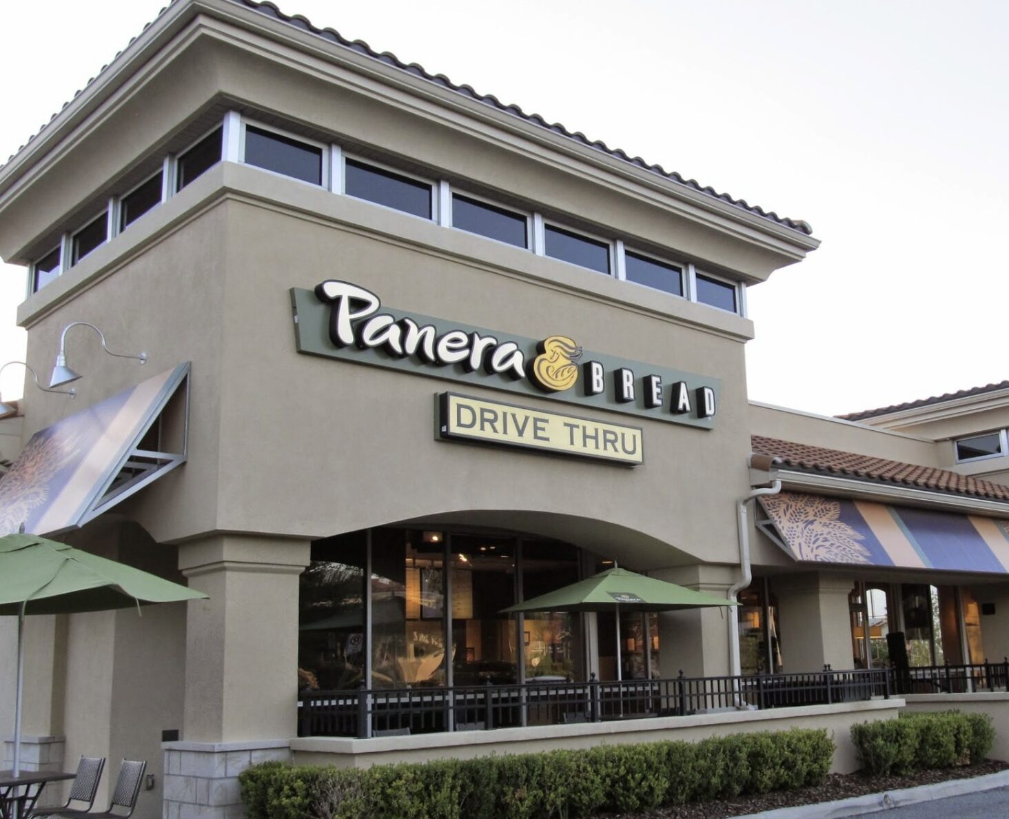
If you’ve ever indulged in the deliciousness of Panera’s menu, you might have overlooked the intriguing evolution of its logo. This iconic brand, which started its journey back in 1987 as The St. Louis Bread Company by Ken and Linda Rosenthal, has a logo history that’s as rich as their freshly baked bread.
Panera, also known as The St. Louis Bread Company, made a significant shift in 1997 when it decided to embrace the name we all know today. But let’s dive into the juicy details that lie behind the layers of its logos, especially the hidden meanings in its current emblem.
The original Panera logo featured a warm touch—a woman affectionately cradling a loaf of bread. As time rolled on, Panera underwent a logo transformation, sprouting five distinct versions. However, one consistent element remained: the woman lovingly holding that essential loaf.
What catches the eye in the latest Panera logo is the positioning of the woman. Facing the camera, she adds a personal and inviting touch, making you feel like you’re about to share a meal with a friend. But here’s where it gets interesting—let’s talk about the subtle yet significant background.
Take a look, and you’ll notice a green arch forming a semi-circle in the background. What’s the deal with this green arch, you ask? Well, the hidden gem lies in its symbolism. It’s no random design choice; instead, it’s crafted to resemble the mouth of an oven. Imagine that! The green arch is essentially a sneak peek into the heart of where the magic happens—the oven that births those heavenly bread creations.
But there’s more to the green arch than just a creative twist. It’s a symbol of Panera’s commitment to using natural products in their recipes. The green color, reminiscent of nature’s bounty, signifies the fresh and wholesome ingredients that go into crafting each item on Panera’s menu.
So, the next time you find yourself savoring a Panera meal, take a moment to appreciate not just the flavors but also the artistry behind the logo. It’s more than just a woman and a loaf of bread—it’s a story of warmth, evolution, and a commitment to quality that’s baked into every Panera experience.